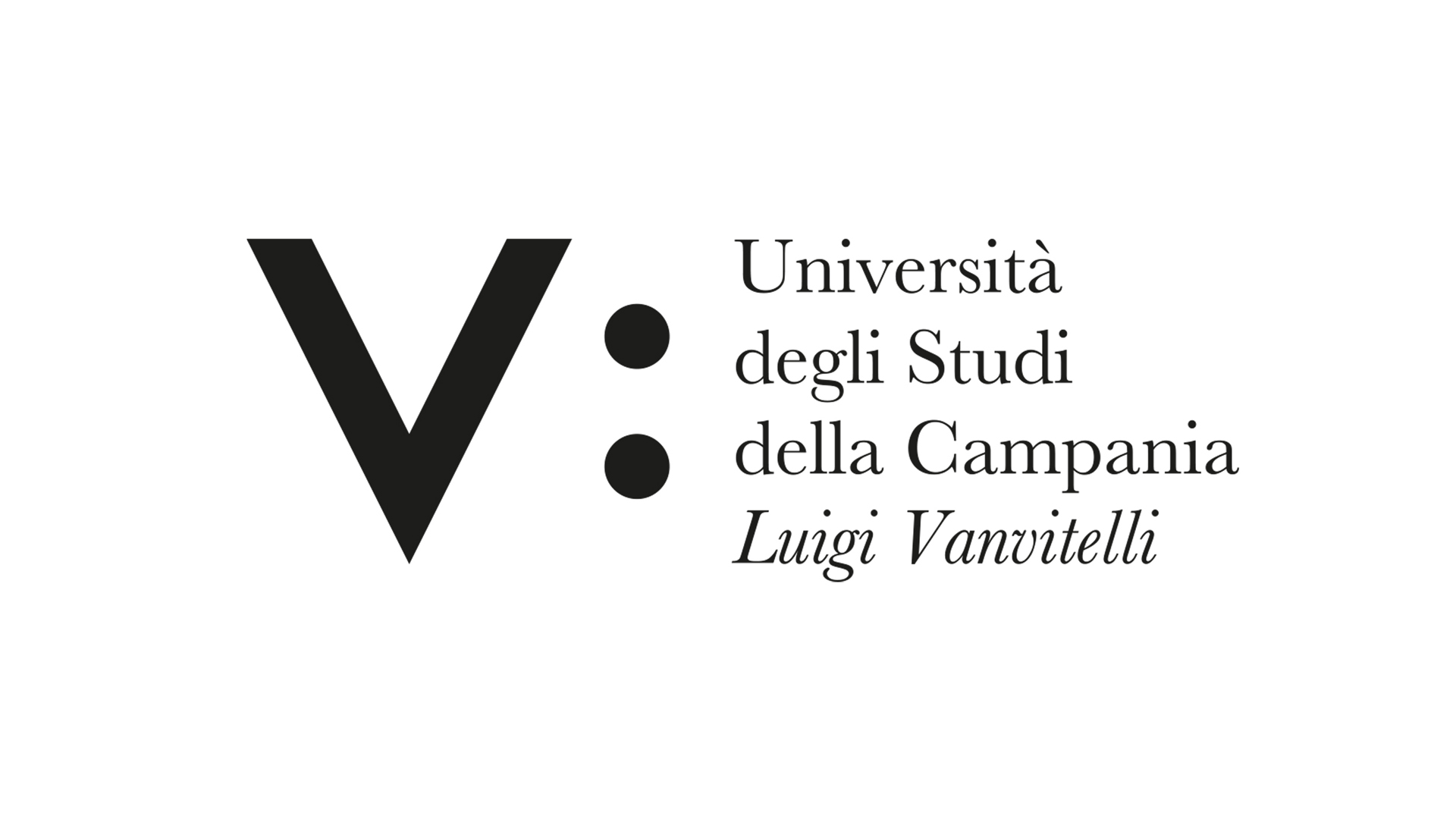
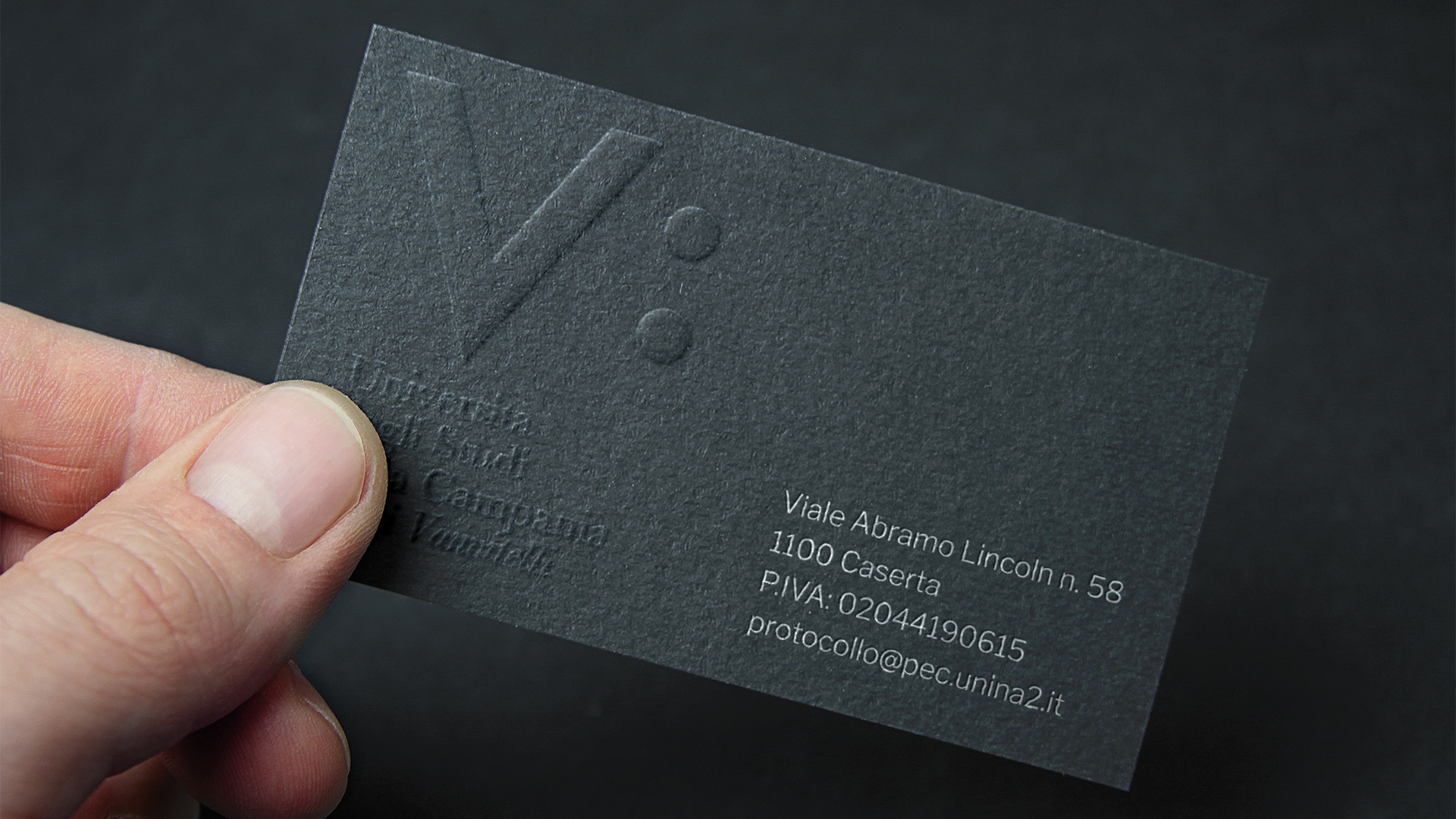

Università degli Studi della Campania “Luigi Vanvitelli”
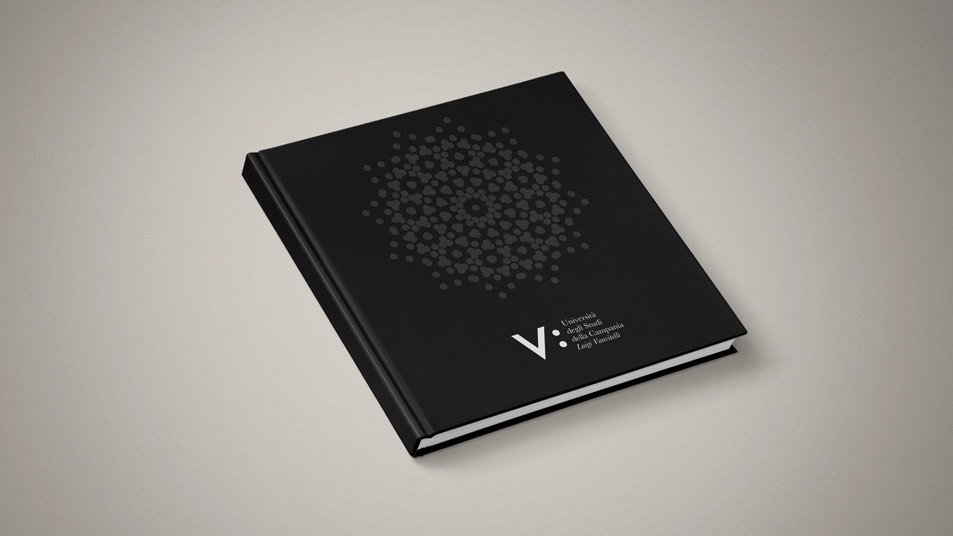
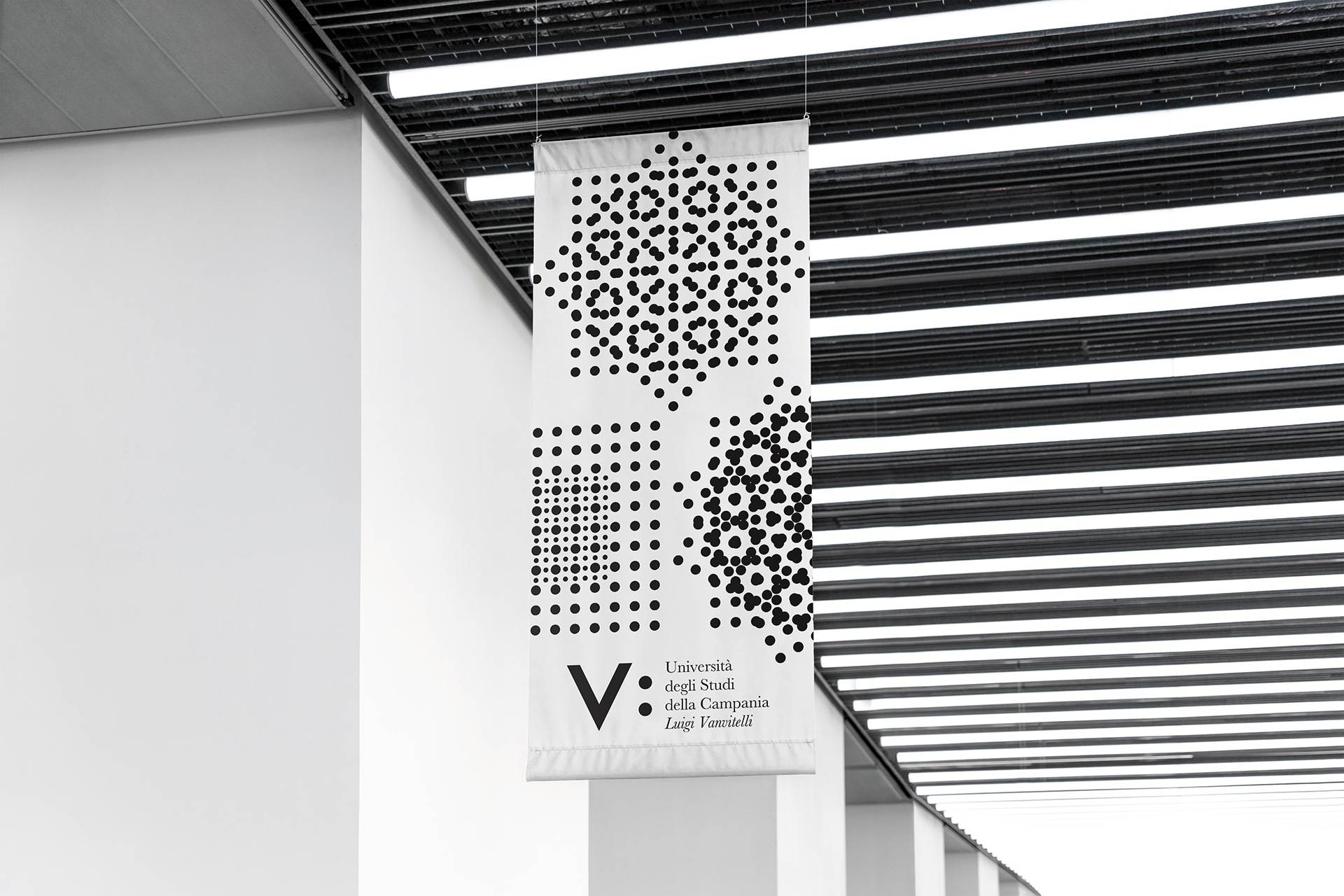
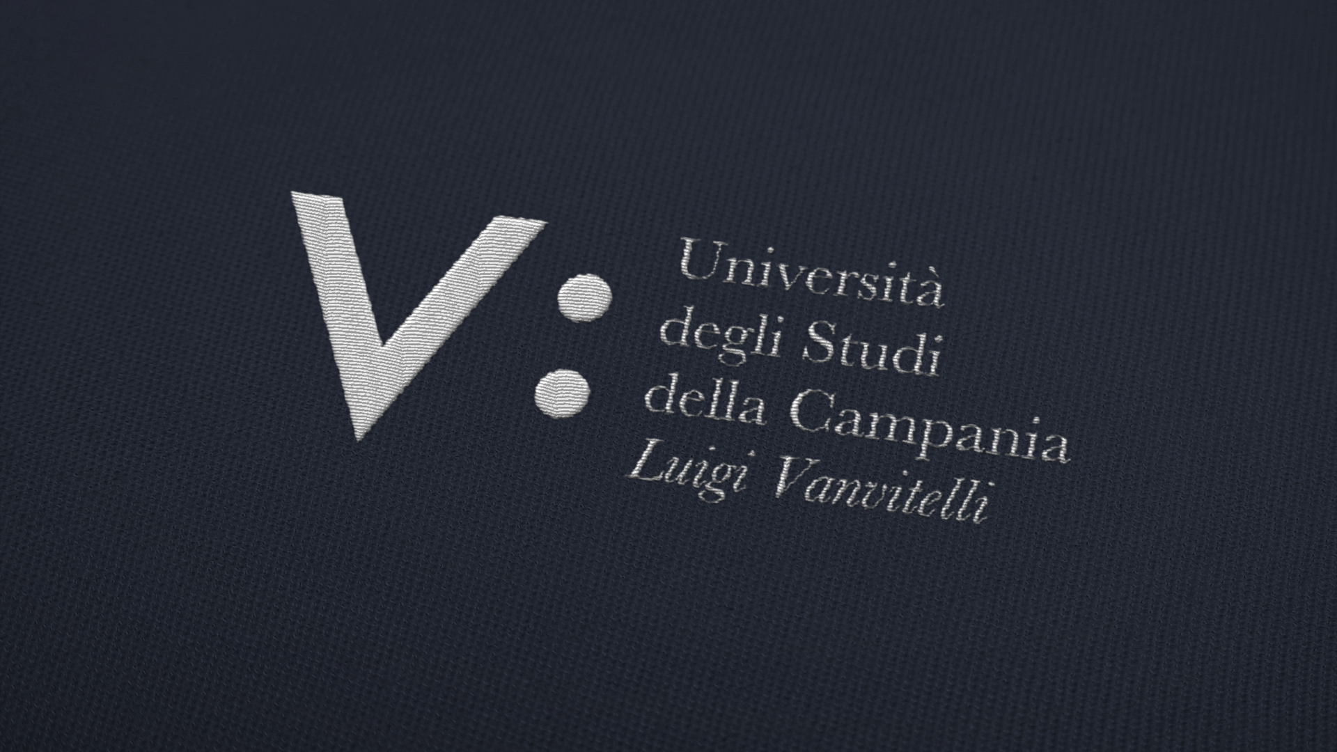
La costruzione del marchio si basa sul disegno del grafema “V” inscritto in un quadrato dal quale scaturisce la griglia compositiva di tutto il sistema d’identità visiva. La «V» rimanda a Vanvitelli ma anche al termine Università: i latini avevano infatti in età classica la sola lettera V, sia con il valore vocalico della «u» italiana di uno (come nel lat. vnvs), sia con quello semiconsonantico della «u» italiana di quale (lat. qvalis). Quindi Vniversità Vanvitelli. I due punti hanno la funzione di spiegare, chiarire, dimostrare, identificare la missione della struttura formativa. V: è l’Università nel suo insieme ma anche le parti che la compongono come le scuole, i dipartimenti; i due punti sono anche «io e l’altro», «lo studente e il professore», «il professore e l’università».
Campania University “Luigi Vanvitelli”
The construction of the brand is based on the grapheme “V”, inscribed in a square, from which the composition grid of the full visual identity originates. The “V” refers to Vanvitelli but also to the term University: the Latins had in fact in the classical age the only letter V, both with the vowel value of the Italian “u” of one (as in the lat. vnvs), and with the semiconsonant one of the Italian “u” of which (lat. qvalis). Hence Vanvitelli University. The two points have the function of explaining, clarifying, demonstrating, identifying the mission of the training structure. V: it is the University as a whole but also the parts that compose it such as schools, departments; the two points are also “me and the other”, “the student and the professor”, “the professor and the university”.
Università degli Studi della Campania “Luigi Vanvitelli”