
ADI Design Index | ADI Compasso d’Oro
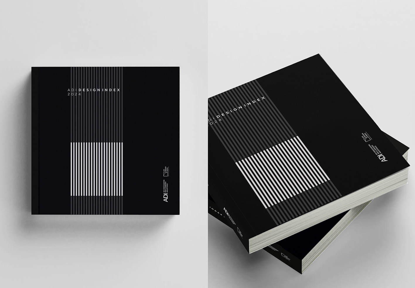
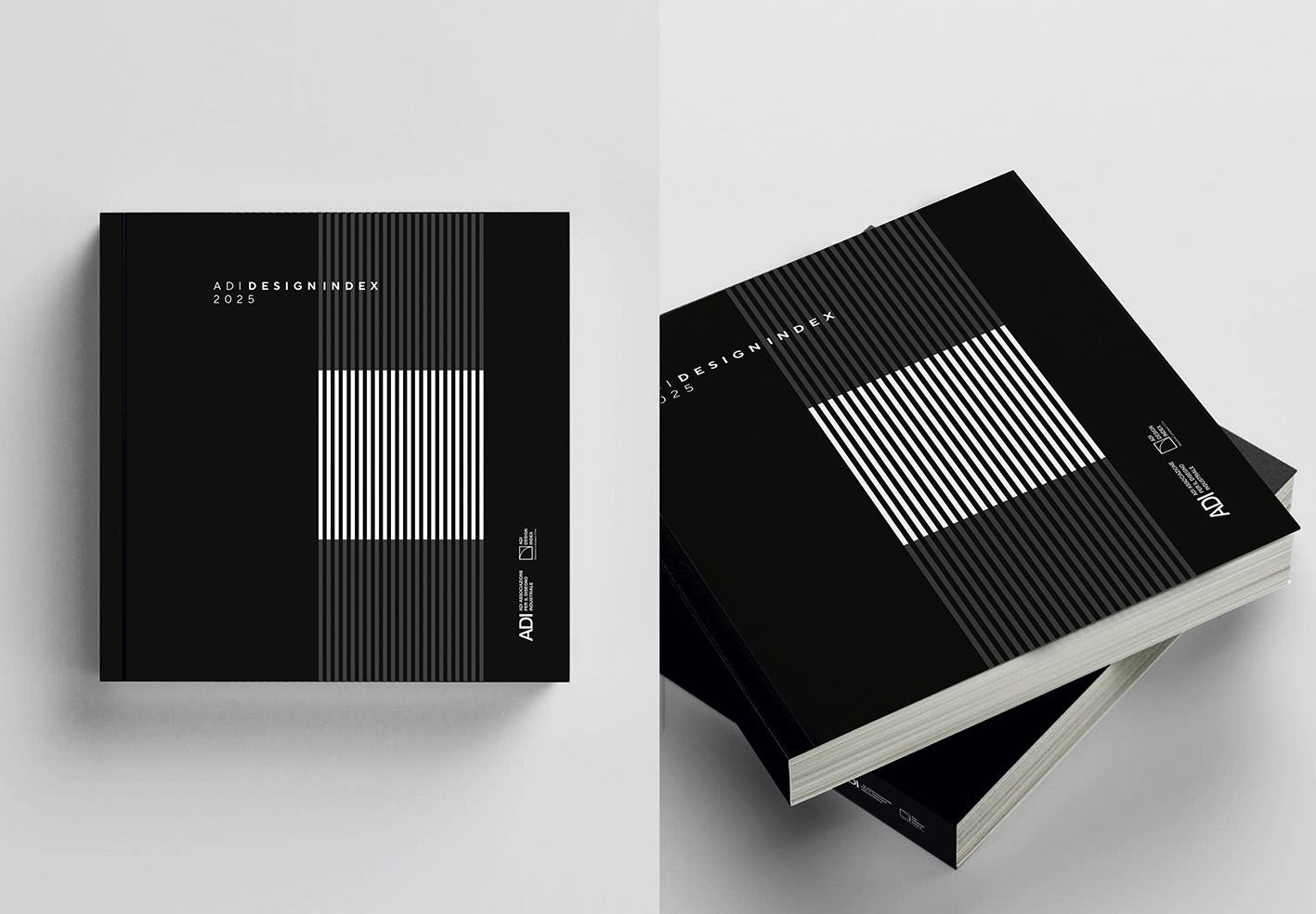
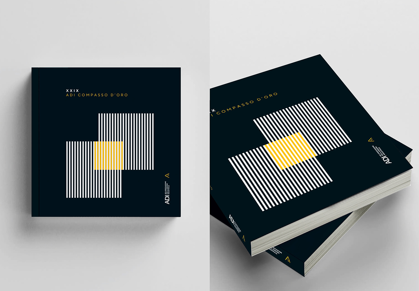
Progetto grafico del catalogo e delle copertine dell’ADI Design Index 2024 | 2025 e del XXIX Compasso d’Oro | 2026.
–
Il progetto si basa sul semplice concetto di linea come entità. Rappresentativa di prodotti, servizi e idee legate al mondo del progetto.
E allora tra le tante linee candidate per la Selezione e il Premio, tra le tante linee grigie che potrebbero rimanere anonime, spiccano quelle bianche, quelle selezionate nell’anno di riferimento.
La selezione nelle due annate come configurazione si sposta solo nello spazio e quindi nel tempo.
Nel volume che contiene l’edizione del Compasso d’Oro rimangono le linee bianche ma avviene un’ulteriore selezione all’interno dello spazio giallo oro: i premiati e menzionati.
Il layout interno dei volumi geometrizza lo spazio e attribuisce gerarchia alle informazioni rendendo semplice la lettura e la codifica dei diversi prodotti.
Anche qui la linea funziona da elemento gerarchico e ordinatore. Il layout a quattro colonne propone flessibilità nell’impaginato e la gabbia simmetrica permette di lasciare ampio spazio di respiro all’interno dell’impaginato. Gli elementi di corredo come inviti e slideshow saranno identificati con lo stesso motivo grafico che rende tutta la comunicazione visiva memorabile e coerente.
ADI Design Index | ADI Compasso d’Oro
Visual design of the catalogue and covers for the ADI Design Index 2024 | 2025 and the 29th Compasso d’Oro | 2026.
–
The project is based on the simple concept of the line as an entity. It represents products, services and ideas linked to the world of design.
And so, amongst the many lines nominated for the Selection and the Award, amongst the many grey lines that might remain anonymous, the white ones stand out – those selected in the year in question.
The selection across the two years, in terms of its configuration, shifts only in space and therefore in time.
In the volume containing the Compasso d’Oro edition, the white lines remain, but a further selection takes place within the golden-yellow space: the award winners and those receiving honourable mentions.
The internal layout of the volumes geometrises the space and establishes a hierarchy of information, making it easy to read and categorise the various products.
Here too, the line functions as a hierarchical and organising element. The four-column layout offers flexibility in the page design, and the symmetrical grid allows for ample breathing space within the layout. Supporting elements such as invitations and slideshows will be identified with the same graphic motif, making the entire visual communication memorable and consistent.
ADI | Associazione per il Disegno Industriale